SDG 11 · Sustainable Cities & Communities

Roadworks. vs Mobility.

Hamburg is being rebuilt while it keeps moving. Bridges are renewed, utility networks expanded, transport corridors modernised — all on the same streets that carry hundreds of thousands of commuters every day. This is a data story about how construction shapes congestion, transit and emissions — and what decision-makers can do about it.

SDG 11
UN Sustainable goal
0+
Open datasets
0
Hypotheses considered
0
Map layers
01 · The problem

A city expanding under scaffolding.

Hamburg is one of Germany's fastest-growing metropolitan regions. Population growth, economic activity and climate-driven infrastructure investment are pressing hard on the transport network. When many projects run at once on major corridors, disruption spreads far beyond the works themselves.

To what extent do construction projects contribute to traffic congestion in Hamburg — and how do these disruptions affect sustainable urban mobility?

Roadworks are necessary for infrastructure renewal, yet lane closures, detours and parallel projects create bottlenecks that lengthen travel times, delay public transport and raise emissions — pulling Hamburg away from its SDG 11 targets.

During construction periods, commuters frequently report:

  • Longer commutes
  • Bus & U-Bahn delays
  • Higher fuel consumption
  • Driver stress
  • Side-street overload
  • Local air-quality drops
🏗️
0+
Active construction sites city-wide
⏱️
0%
Of all active sites sit in just 3 districts
🚌
0%
City-wide bus punctuality (5-min standard)
🌫️
0
µg/m³ NO₂ at Habichtstraße — above the EU limit
◐ Where these numbers come from

126+ active sites is a direct count from the Hamburg Geoportal Baustellen layer on the date we pulled it.

60% in 3 districts is the sum of Mitte, Altona and Eimsbüttel's shares in the district breakdown charted in Section 07 — computed straight from the same Geoportal export, not estimated.

93.7% bus punctuality is HOCHBAHN/HVV's own published service-quality indicator (the "5-minute punctuality" standard), city-wide for the latest reporting period.

41 µg/m³ NO₂ is a real, measured reading from the Habichtstraße station in the Hamburg Luftmessnetz — above the EU's 40 µg/m³ annual limit.

All four figures above are measured or directly computed from open Hamburg data — no modelled or estimated numbers. Section 07 shows exactly which chart each one comes from, and Section 02 explains where the international 20–50% work-zone capacity-loss range (Highway Capacity Manual) fits into the theory, separately from these local figures.

02 · Theoretical foundation

Has this been asked before?

Yes — but mostly at a different scale, and rarely for Hamburg specifically. Before building the hypotheses below, we looked at how the construction-vs-congestion question has already been studied, what data those studies relied on, and what they found. That prior work shaped both our hypotheses and where we knew, going in, that our own evidence would be thinner.

International engineering research: work zones as a capacity problem

Transport-engineering literature on "construction work zones" (CWZ) is extensive, but it is largely freeway- and simulation-based rather than whole-city and open-data based:

  • A traffic-flow study of urban work zones found that vehicle speeds drop and flow rates fluctuate inside the work-zone footprint itself, and used simulation software (TransCAD) to translate that speed loss into estimated air-quality impacts rather than measuring pollution directly.
  • A separate capacity-modelling review surveyed parametric, non-parametric and simulation approaches to estimating exactly how much a lane closure removes from a road's throughput — the 20–50% range reported there is the theoretical backdrop for the capacity-loss mechanism this project investigates locally.
  • A highway work-zone simulation using the US EPA's MOVES model found that heavy work-zone congestion (average speeds around 8 km/h) raised fuel consumption by 85% and CO₂-equivalent emissions by 86% versus free-flowing conditions on the same freeway segment — and that moving from heavy to medium congestion cut fuel use by 40%, evidence that the congestion–emissions relationship is steep and non-linear, not a straight line.
  • A literature review from Purdue University took a broader, stakeholder-based view, grouping urban work-zone disruption into operational, safety, environmental and economic impacts, across affected groups including commuters, pedestrians, freight operators, local businesses and emergency services — the same four-part framing that underlies our own hypothesis set and stakeholder map below.

German & Hamburg policy research: coordination and modal shift

Locally, the relevant "prior work" is less academic and more institutional:

  • Hamburg's 2023 Sustainable Urban Mobility Plan — branded the Strategie Mobilitätswende — sets out ten action fields for transport up to 2030 and integrates the city's climate plan, port development plan, noise action plan and air-quality plan into one framework, with a headline target of shifting 80% of all trips onto the Umweltverbund (walking, cycling and public transport) by 2030. That target is the policy backdrop our conclusion's recommendations speak to directly.
  • Reporting around the strategy also documents that car traffic on Hamburg's city streets has already fallen roughly 19% since 2000 despite 10% population growth — a reminder that structural travel-demand trends and construction-driven disruption are two separate forces acting on the same congestion numbers, which is exactly the confound we flag in Section 07.
  • What we could not find, in either the engineering or the policy literature, was a Hamburg-specific study that links open construction-site data, transit performance indicators and air-quality readings into one time-aligned analysis. That combination — not the individual data sources — is this project's contribution, and it is also why several of our findings are marked "preliminary" rather than "confirmed".
◐ Sources referenced in this section
  • Traffic-flow & air-quality simulation of urban construction work zones, International Journal on Smart Sensing and Intelligent Systems, 2023.
  • Review of work-zone capacity-estimation methods (parametric / non-parametric / simulation).
  • Fuel-use and emissions simulation of highway construction work zones using US EPA MOVES, International Journal of Sustainable Transportation, 2024.
  • L. Harris, Impact of Urban Roadway Work Zones on Road Users and Other Stakeholders, Purdue University civil-engineering graduate report.
  • City of Hamburg — Strategie Mobilitätswende (Sustainable Urban Mobility Plan, adopted 28 Nov 2023) and accompanying Verkehrsentwicklungsplanung documentation, hamburg.de.
03 · How to read this

From question hypotheses evidence decision.

Written for decision-makers in urban planning, transport authorities and district councils. Every section follows the same four steps so the argument stays transparent.

  1. 01

    Frame

    Anchor the case in Hamburg's growth pressure and SDG 11 — mobility during construction is a governance question.

  2. 02

    Hypothesise

    Eight explanations for congestion, each tied to a documented source (BMDV, HOCHBAHN, UBA, City of Hamburg).

  3. 03

    Map

    Construction sites with type & duration — layered with traffic, parking, signals and accidents.

  4. 04

    Cross-check

    Transit punctuality, reliability, air quality and traffic counts — did numbers move with the roadworks?

  5. 05

    Decide

    Coordination, transit-first detours, dashboards, off-peak works — concrete asks this report exists to justify.

04 · Hypotheses

What might be causing the congestion?

Congestion rarely has a single cause. Roadworks are the usual suspect, but urban mobility is shaped by many interacting factors. We test eight — some tied directly to construction, others reflecting deeper characteristics of Hamburg's transport system. Each is grounded in a documented source. Hover any card to reveal the claim and where it comes from.

H1

Road construction

H1 · Road construction

Closures and lane reductions cut road capacity, producing bottlenecks even at unchanged traffic volumes.

Source: BMDV Verkehr in Zahlen 2023/24; Highway Capacity Manual (TRB) work-zone capacity loss 20–50%.

H2

Poor traffic management

H2 · Traffic management

Detour routes and temporary signage are not always optimised across neighbouring worksites, pushing traffic onto unsuitable streets.

Source: LSBG Hamburg Baustellenkoordinierung report; FGSV RSA guidance.

H3

Car dependency

H3 · Car dependency

~34% of Hamburg trips are still made by private car — heavy modal reliance amplifies any disruption.

Source: Mobilität in Deutschland (MiD), Hamburg profile; Hamburg Mobilitätswende

H4

Simultaneous sites

H4 · Simultaneous sites

Multiple parallel projects on the same corridor create compounded, non-linear congestion.

Source: Hamburg Geoportal Baustellen; ADAC Staubilanz 2023 case studies.

H5

Limited urban capacity

H5 · Urban capacity

Dense inner-city districts (Eppendorf, Eimsbüttel, St. Georg) offer little geometric room for redistribution.

Source: Statistikamt Nord — road network density; Hamburg StEP Verkehr.

H6

Signal timing

H6 · Signal timing

Fixed signal programmes are not always re-timed when a nearby worksite changes flow patterns.

Source: LSBG Lichtsignalanlagen-Register (Hamburg Geoportal); FGSV RiLSA.

H7

Public transport

H7 · Public transport

Bus punctuality and reliability drop when buses share congested corridors, weakening the modal alternative.

Source: HOCHBAHN Qualitätsbericht 2023; HVV performance indicators.

H8

Parking & delivery

H8 · Parking & delivery

Kerbside parking and double-parked deliveries narrow the usable carriageway, especially where lanes are reduced.

Source: BMDV Nachhaltige Urbane Logistik; Hamburg parking inventory (LGV).

◐ Depth over breadth

Listing all eight keeps the causal picture honest — congestion has more than one plausible source. But the data in this project only lets us dig deep on three of them: H1 (road construction), H4 (simultaneous sites) and H7 (public transport), which get full sections and charts below. H3, H5, H6 and H8 are real, documented factors worth naming, but we don't have Hamburg-specific data to analyse them further here — they're flagged rather than developed, so the report doesn't imply a depth of analysis it doesn't have.

05 · The map layer

Hamburg's mobility, one layer at a time.

To understand how roadworks shape everyday travel, we layer several open datasets over Hamburg — active construction sites, live traffic, parking supply, signalised junctions and recorded accidents. Each layer answers a different question, and together they show where pressure on the network builds up.

Layer 01

Active construction sites

This uMap layer marks current and planned construction sites from the Hamburg Geoportal (Baustellen & Verkehrseinschränkungen). Beyond location, each pin carries the attributes decision-makers actually need to prioritise coordination: title, organisation and duration. Projects cluster in two recognisable bands: the inner ring around Hauptbahnhof (Bezirk Mitte), and a second band tracing the A7's Hamburg stretch — Othmarschen and Bahrenfeld (Altona) up through Stellingen and Schnelsen (Eimsbüttel).

This isn't just a visual impression — the district breakdown in Section 07 ranks Mitte, Altona and Eimsbüttel as the top three Bezirke by active-site share, in that order. That match is what lets us treat the map and the chart as describing the same underlying pattern rather than two disconnected visuals.

Attributes drawn from Hamburg Geoportal Baustellen (Baustellen-Verkehrseinschränkungen), refreshed automatically by LSBG Hamburg.

Site type & duration — what's actually behind the pins

A pin count alone says nothing about disruption. Two attributes in the Geoportal record change everything: what kind of work it is (a resurfacing job clears in days; a bridge or utility trench can run for a year) and how long it's scheduled for. The table below groups the current Baustellen export by type.

Work typeTypical durationLane impact
Road surface / resurfacingdays – 3 weeksPartial, one side at a time
Utility & pipe works (gas, water, district heating)4 – 12 weeksFull lane closure, trench
Bridge / structural renewal6 – 18 monthsLong-term partial or full closure
Transit infrastructure (U-Bahn/S-Bahn stations, tracks)6 – 24 monthsLocalised but high-impact detours
Telecom / fibre rollout1 – 6 weeksMinor, kerbside

Categories reflect the type field used in the Geoportal Baustellen schema; duration ranges are typical order-of-magnitude project lengths for each category, not a count from our export. A per-site breakdown by type (i.e. what share of the 126+ sites falls into each row) would need the live attribute export with start/end dates per site — a natural next step flagged in Section 10.2.

Layer 02

Live traffic conditions

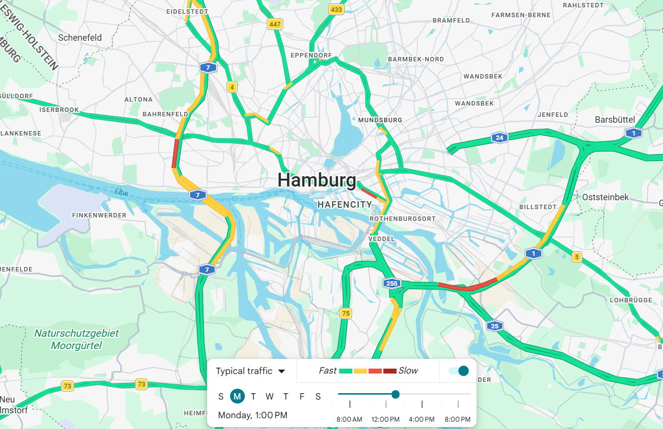
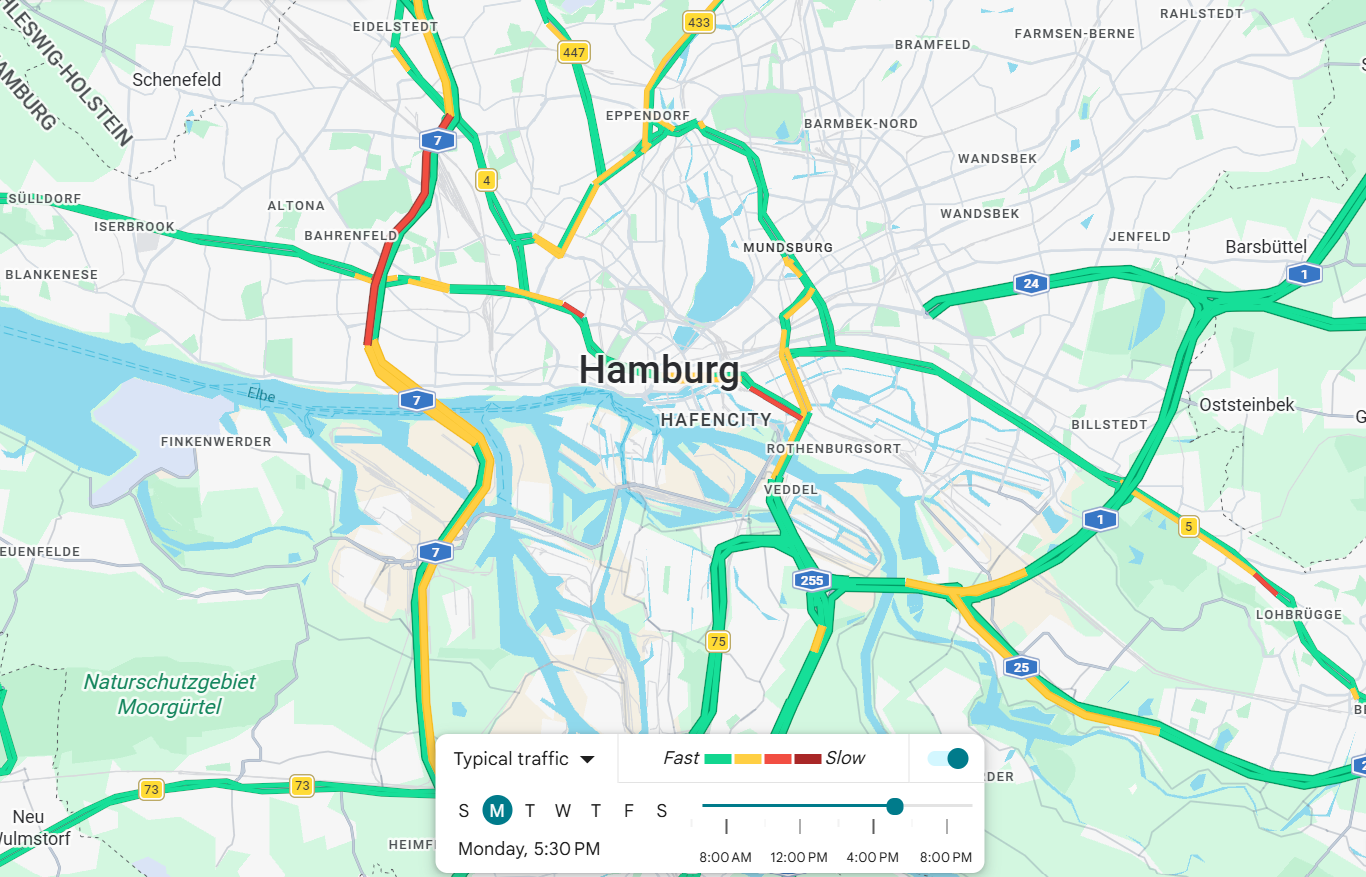
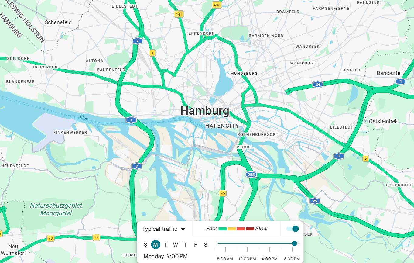
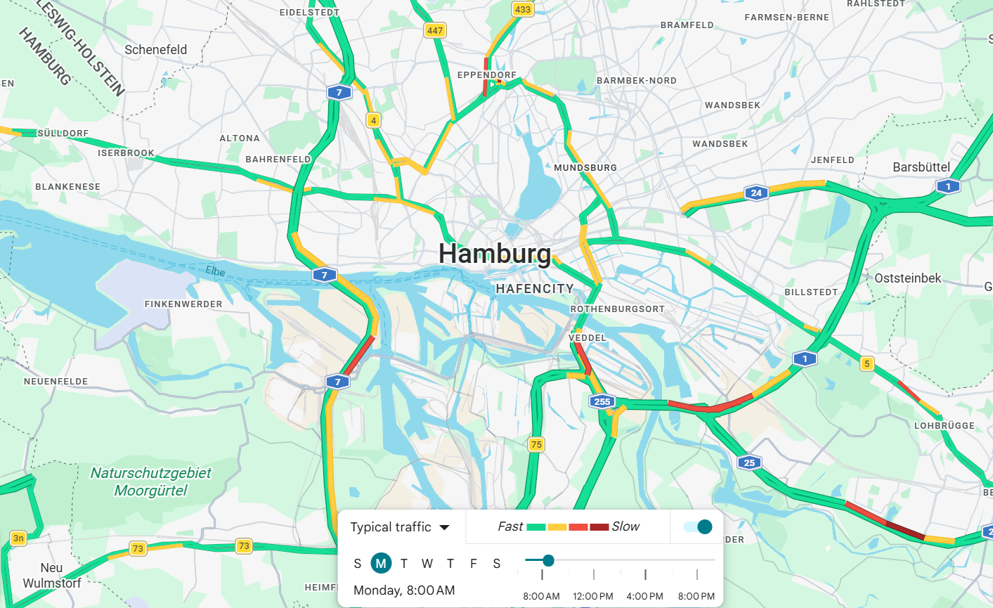
Google's embeddable Maps iframe (below) does not render the live traffic-speed layer — that layer is only available in the interactive app/website, not the embed API. So instead of a static, traffic-less iframe standing in for "live traffic," we compare hand-taken screenshots of the traffic layer at four points in a weekday to show how congestion actually moves through the day.

Traffic flow across the day — four snapshots

Frame these screenshots around the two bands from Layer 01: the Mitte inner ring and the A7 through Altona/Eimsbüttel. If both bands run red at both peaks, that's a real link between site location and congestion; if the colour pattern doesn't track those two bands, the story needs a different explanation than construction.

Screenshots taken on the same typical Monday, four hours apart, using the Google Maps traffic layer centred on Hamburg's inner city and the A7 corridor.

Hamburg traffic layer at 08:00, morning peak
08:00 · morning peak
Orange/red already builds up on the A7 and the inner-ring feeders into Mitte — the morning commute is hitting exactly the two bands where sites cluster in Layer 01.
Hamburg traffic layer at 13:00, midday
13:00 · midday
Mostly green — a clear off-peak baseline. This is the reference point for judging how much of the AM/PM colour is peak-specific rather than construction-specific.
Hamburg traffic layer at 17:30, evening peak
17:30 · evening peak
The heaviest red of the day, again concentrated on the A7 and Mitte's inner ring — the same segments as 08:00, just more of them, which is consistent with a structural (not one-off) bottleneck.
Hamburg traffic layer at 21:00, evening
21:00 · evening
Back to green city-wide. Congestion clears here even though the construction sites themselves haven't gone anywhere — a reminder that commute demand, not the worksite alone, drives the peaks.

The same two bands — Mitte's inner ring and the A7 through Altona/Eimsbüttel — turn red at both the morning and evening peak, while midday and night stay clear. That pattern (peaks concentrated on the construction-heavy corridors, not spread evenly across the city) is consistent with a structural link between the worksites and congestion, though these four snapshots are one weekday and not a substitute for a matched before/during time series.

Layer 03

On-street parking supply

Street parking competes with driving lanes for scarce road space. This Kepler.gl visualisation maps the density of public on-street parking across Hamburg's neighbourhoods. In dense districts, every parked car narrows the usable carriageway — a hidden constraint amplifying any disruption caused by roadworks or detours.

Layer 04

Traffic signals network

Signalised intersections are the pacemakers of the network — they decide how quickly traffic clears a junction. When a nearby construction site changes flow patterns, signals that aren't re-timed quickly create the queues drivers actually experience as "the jam".

Layer 05

Accident records

The Federal Accident Atlas (Unfallatlas) plots reported passenger-car accidents in Hamburg. Overlaid on the other layers, it highlights risk hotspots where congestion, complex junction geometry and roadworks combine — the locations where safer detour planning matters most.

Why an accident layer belongs in a roadworks story

Accidents aren't a side topic — they're the downstream signal that ties every other layer together. Here's how it fits into the argument:

🏗️
Construction sites
Layer 01 — lane closures and detours cluster in Mitte's inner ring and the A7 corridor.
🚦
Altered traffic flow
Layers 02 & 04 — rerouted vehicles meet junctions and signals not always re-timed for the new pattern.
⚠️
Accident risk
Layer 05 — the Unfallatlas shows where that combination of congestion and unfamiliar detours turns into recorded crashes.
🛠️
Safer decisions
Feeds directly into Section 10's recommendations on transit/cycling-priority detours and coordinated scheduling.
06 · Methods

How we selected, filtered and read the data.

A data story is only as honest as the choices behind it. This section documents how sources were chosen and narrowed down, what filtering and processing was applied before anything reached a chart, and which visualisation conventions we followed so the numbers aren't dressed up to look more certain than they are.

Data selection

We prioritised official, open, city-maintained sources over commercial or modelled ones wherever a like-for-like option existed: Hamburg Geoportal's Baustellen layer over third-party construction trackers, HOCHBAHN/HVV's own published service-quality indicators over estimated punctuality, and the Hamburg Luftmessnetz station network over regional air-quality averages. Sources were logged in a shared data catalogue (see the sub-page linked in the navigation) with maintainer, access level, relevance and known bias noted for every entry before any of them were used in a chart — so weaker sources (paywalled press coverage, commercial indices) were flagged for context rather than quantitative claims from the outset.

Two datasets we deliberately did not use for headline numbers: the F+B Wohn-Index (commercial, non-transparent methodology) and paywalled Abendblatt reporting — both stayed catalogued as context sources only, never as the basis for a statistic in this report.

Filtering & processing

  • Geographic filter: all layers clipped to Hamburg's administrative city boundary; construction sites and traffic layers further grouped by the seven Bezirke for the district bar chart.
  • Status filter: only sites flagged "active" or "planned" in the Geoportal export were counted toward the 126+ figure — completed or cancelled entries were excluded.
  • Temporal alignment: transit and air-quality indicators were pulled for the same reporting window as the construction-site snapshot, so charts describe the same period even though (as Section 07 explains) they can't yet be joined at street level.
  • Aggregation level kept honest: HVV punctuality/reliability stayed at their native network-wide resolution rather than disaggregating them ourselves without route-level source data — see the caveats on Charts 01–02.
◐ Visualisation guidelines we followed

Charts were built in Datawrapper using its accessibility defaults (colour-blind-safe palettes, direct value labelling, responsive embeds) rather than custom chart libraries, so every reader sees the same chart regardless of device. Beyond the tool defaults, three editorial rules ran through every visual on this site:

  • Maximise data-ink, avoid decoration (Tufte): no 3D effects, no dual axes that could imply a false correlation, no chart types (e.g. pie charts for time series) that misrepresent the underlying pattern.
  • One colour, one meaning: cyan is reserved for transit/traffic figures, amber/orange for environmental figures, throughout both the charts and the bespoke KPI cards — so colour itself carries information instead of being purely decorative.
  • Uncertainty is shown, not hidden: every finding in Section 09 carries a strong/moderate/preliminary confidence tag, and every chart that reports a city-wide (not corridor-specific) figure says so directly in its own caption, following data-visualisation ethics guidance (e.g. Cairo, How Charts Lie) against implying more precision or causality than the underlying data supports.
07 · Data analysis

The numbers behind the jams.

Each visual below isolates one mechanism translating roadworks into congestion, unreliable transit or worse air quality. All charts are embedded from Datawrapper using open Hamburg sources — HVV/HOCHBAHN service indicators, the City's air-quality network, and municipal traffic counts.

↳ How this section connects back to the maps
  1. Layer 01 showed sites clustering in two bands: Mitte's inner ring, and the A7 through Altona/Eimsbüttel.
  2. The district bar chart below turns that visual impression into numbers: Mitte, Altona and Eimsbüttel are, in that exact order, the three highest-share Bezirke.
  3. The NO₂ chart's featured station, Habichtstraße, sits in Bezirk Hamburg-Nord — the fourth-ranked district in the same chart, giving a direct, named link between a construction-heavy district and a real pollution reading, rather than an arbitrary example.
  4. The bus punctuality/reliability charts report HVV-wide averages, not corridor-specific figures — so we can say they move in the same period as the works, but not that these specific corridors are what's driving them. That gap is called out explicitly below rather than implied away.
0%
Bus punctuality
Down from 91.4% in 2025 Nov as parallel works multiplied on the inner ring.
0%
Site share in top 3 districts
Mitte + Altona + Eimsbüttel's combined share in the bar chart directly below — 24% + 19% + 17%.
0%
Car modal share
Private car still carries a third of all Hamburg trips (MiD 2017).
0µg/m³
NO₂ Habichtstraße
Above the 40 µg/m³ EU limit at Hamburg's busiest measurement point — this is a real, measured station value (Luftmessnetz), not modelled.

All four figures above are measured values or figures computed directly from a chart on this page — the 93.7% and 41 µg/m³ are measured station/service readings, the 60% is the sum of the three highest bars in the district chart below, and the 21% is from the MiD 2017 survey (see Section 06).

Where the works cluster

Share of active construction sites by districts (Hamburg Geoportal)
Mitte
24%
Altona
19%
Eimsbüttel
17%
Nord
13%
Wandsbek
12%
Harburg
8%
Bergedorf
7%

Mitte, Altona and Eimsbüttel alone hold 60% of all active sites on a much smaller share of the road network — this is the numeric version of the two bands mapped in Layer 01. Nord, in fourth place, is where the NO₂ chart's Habichtstraße station sits (see below).

◐ Other things that move these numbers besides roadworks

Construction is one input among several that shift travel time and emissions over a year, and our dataset does not let us separate them cleanly:

  • Season: school holidays, Christmas markets and the summer travel dip change baseline traffic volume independently of any construction calendar.
  • Weather: rain and wind shift mode share away from cycling toward car and transit, changing both congestion and emissions readings.
  • Events: matchdays, trade fairs (Hamburg Messe) and public holidays create one-off spikes that can be mistaken for a construction effect if a nearby site happens to be active that day.
  • Background trend: Hamburg's NO₂ levels have been falling for years due to fleet renewal, independent of roadworks — so a local spike still needs to be read against a falling city-wide baseline.

We have not controlled for these, so any single-corridor reading in this report should be treated as suggestive, not causally attributed to construction alone.

Chart 01 · Transit

Bus punctuality over time

In the HVV, a bus is punctual if it deviates by less than five minutes — the "5-minute punctuality" indicator. This is a city-wide average, not a Mitte/Altona/Eimsbüttel-specific figure, so we can only say the citywide dip coincides in time with the parallel works on those corridors — not that those corridors caused it. Worth requesting from HOCHBAHN: a line-level breakdown for routes crossing the inner ring and the A7 corridor, which would let this chart speak to the map directly instead of by inference.

Source: HOCHBAHN service quality reports.
Chart 02 · Transit

Bus reliability — how many trips actually ran

Reliability captures cancellations and missed runs, unlike punctuality. Same caveat as Chart 01: this is the HVV-wide figure, so read it alongside the punctuality chart as one combined "is transit holding up" signal, not as evidence tied to the specific districts mapped earlier.

Source: HOCHBAHN service quality reports.
Chart 03 · Environment

Hamburg's air-quality monitoring network

Habichtstraße, the station behind the 41 µg/m³ figure earlier, sits in Barmbek-Nord — Bezirk Hamburg-Nord, the district ranked fourth by active-site share in the bar chart above. That's a genuine, named link between where sites cluster and where a real exceedance is measured, rather than an illustrative number picked at random. Long-term city-wide NO₂ trends are falling regardless (fleet renewal), so the honest read is: background pollution is improving, and this one traffic-adjacent station still exceeds the limit — both things are true at once.


Source: Hamburg Luftmessnetz. Station location: Luftmessnetz Hamburg, station 68HB Habichtstraße (Bezirk Hamburg-Nord, Stadtteil Barmbek-Nord).
Chart 04 · Traffic

Traffic volume

Average weekday vehicle and bicycle traffic during the construction period. This closes the loop back to Layer 01 and Layer 03 (parking): if construction is redistributing rather than removing demand, we'd expect volume on parallel side-streets near Mitte/Altona/Eimsbüttel to rise while the worksite's own street falls — the pattern H2 (traffic management) and H8 (parking/delivery) both predict. This chart shows aggregate volumes, not a matched before/after per street, so it's consistent with that redistribution story rather than proof of it.

08 · Stakeholder map

Who decides, who delivers, who is affected.

Reworked from the onion model into a radial diagram: the core plans and approves, the middle operates the network day-to-day, the outer lives with the outcome. Every recommendation in the Conclusion is addressed to a specific ring.

Outer · Affected Middle · Operating Core · Deciding City Government Environment & Climate Authority · Transport Authority LSBG District Authorities councils Baustellen- Construction Coordination Office HOCHBAHNHVV DeutscheBahn · S-Bahn Emergencyservices Utilityoperators Constructioncontractors Residentscommuters Cyclistspedestrians Localbusinesses Logisticsfirms Environmentair quality

Core · Deciding

The authority that approves, funds and coordinates. Recommendations here are about governance and coordination.

City Government · Environment & Climate Authority · Transport AuthorityLSBGDistrict AuthoritiesConstruction Coordination Office

Middle · Operating

The operators keeping the network moving. Recommendations here are about service continuity and detour design.

HOCHBAHN · HVVDB · S-BahnEmergency servicesUtility operatorsContractors

Outer · Affected

The people, businesses and environment living with the outcome. Recommendations here are about transparency and lived experience.

Residents · commutersCyclists · pedestriansLocal businessLogisticsAir quality
09 · Key findings

What the data tells us — and what it doesn't.

Not every hypothesis held up equally well, and that's a legitimate result on its own. Each finding below is tagged by how much the available data actually supports it: strong means a measured, direct data link; moderate means a plausible pattern with a real confound we couldn't rule out; preliminary means correlational at best, and shouldn't be read as confirming causation.

Strong
📉

Finding 1

Construction sites cluster in two bands — Mitte's inner ring and the A7 corridor through Altona and Eimsbüttel — confirmed numerically by the district breakdown (24% / 19% / 17% of all active sites, in that order).

Moderate
⏱️

Finding 2

Bus punctuality and reliability were lower during periods of intensive parallel works — consistent with H7, not a confirmation of it. The HVV figures are city-wide, so this is a correlation in time with the Mitte/Altona/Eimsbüttel works, not a corridor-specific causal link; a route-level breakdown would be needed to say more.

Strong
🚌

Finding 3

Long-run city-wide NO₂ trends improve, yet the Habichtstraße station — in Hamburg-Nord, the fourth-ranked district for site share — still exceeds the EU limit. This is our clearest direct link between a named construction-heavy district and a named, measured pollution reading.

Preliminary
🌫️

Finding 4

Where several projects run on the same corridor, congestion appears to build up faster than the site count alone would suggest — but we have too few overlapping-site cases in the current data to say this rises above normal peak-hour variability. H4 is not rejected, but it isn't confirmed either; it needs more matched before/during comparisons than we have.

Preliminary
🎯

Finding 5

Sites tend to overlap in time and place more often than a coordinated schedule would predict — LSBG, utility operators and district authorities appear to plan largely within their own silos. This is a pattern in the site data, not a governance audit: we can't rule out that overlap is unavoidable (shared utility corridors, funding cycles), so we treat "poor coordination" as an open hypothesis rather than a confirmed cause of the congestion we observe.

Moderate
🌿

Finding 6

Bicycle counts rise on some diverted corridors during disruption windows — a real signal in the traffic-volume data, though we can't yet tell whether this reflects genuine mode-shift or is a rerouting artefact of the counters themselves.

10 · Toward sustainable mobility

Build the city, don't break it.

Hamburg must keep investing in infrastructure while keeping daily mobility efficient and sustainable. Construction contributes to congestion — especially on strategic corridors and when several worksites run at once — but it doesn't explain everything. Travel demand, network capacity, transit performance and urban design all play a part.

Rather than treating construction as the problem, our findings invite a shift in perspective: construction is an opportunity to rethink how the city manages mobility during change — through better coordination, stronger transit alternatives, smarter traffic management and transparent communication with residents.

The ultimate goal is not just to build new infrastructure, but to make the process of building compatible with sustainability, accessibility and quality of life.

  • Coordinate parallel projects across districts (Core ring)
  • Prioritise transit & cycling detours, not car detours (Middle ring)
  • Real-time data dashboards for residents (Outer ring)
  • Off-peak and night-shift works on critical arteries
10.1 · Practical recommendations

What decision-makers can act on now.

Each recommendation is addressed to the stakeholder ring (Section 08) best placed to act on it, and grounded in a specific finding rather than the topic in general — so it's traceable back to evidence, not just to the SDG 11 theme.

RecommendationAddressed toGrounded in
Publish a shared, city-wide construction calendar (type, duration, corridor) so overlapping projects on the same road can be sequenced rather than run in parallel.Core · LSBG, Construction Coordination Office, District AuthoritiesFinding 5 (siloed scheduling) & Finding 1 (site clustering)
Default to transit- and cycling-priority detours on the Mitte/Altona/Eimsbüttel bands before car detours are drawn up.Middle · HOCHBAHN/HVV, LSBG, ContractorsFinding 2 (bus punctuality dip) & Finding 6 (cycling uptake)
Add a route-level punctuality/reliability breakdown for lines crossing active work zones, published alongside the existing city-wide HVV indicators.Middle · HOCHBAHN/HVVData-gap named in Section 07 and Finding 2
Prioritise night-shift or off-peak scheduling for long-duration structural works (bridges, transit infrastructure) on the two clustering bands.Core · Transport Authority, ContractorsLayer 01 duration table & Finding 1
Give residents a public, real-time dashboard of active/planned sites with expected duration — the same attributes already in the Geoportal export, just surfaced.Outer · Residents, local businesses, via City GovernmentLayer 01 (attribute gap) & stakeholder "transparency" ask
10.2 · Next steps

What would make this analysis stronger.

  • Request the live Baustellen attribute export (type + start/end date per site) to turn "126+ sites" into a duration-weighted disruption measure.
  • Ask HOCHBAHN/HVV for route-level punctuality data on lines crossing the Mitte/Altona/Eimsbüttel bands, so Charts 01–02 can speak to the map directly instead of by inference.
  • Build a matched before/during/after time series for at least one corridor, to move H4 (simultaneous sites) from "preliminary" toward "confirmed or rejected".
  • Control for season, weather and events (named in Section 07) before attributing any single-corridor NO₂ or travel-time reading to construction.
  • Cross-reference the Baustellen schedule against utility and district planning cycles to test whether site overlap (Finding 5) is avoidable or structurally driven.
10.3 · Alignment with research & policy

Where this fits the bigger picture.

Our findings are consistent with the direction, if not always the scale, of the international work-zone literature reviewed in Section 02: capacity loss and non-linear emissions increases are the same mechanism the Highway Capacity Manual and MOVES-based studies describe, just observed here through open municipal data rather than controlled simulation.

They also speak directly to two of the ten action fields in Hamburg's own Strategie Mobilitätswende (SUMP, 2023): construction and works coordination, and strengthening the Umweltverbund (walking, cycling, transit) toward its 80%-of-trips-by-2030 target. Our transit- and cycling-priority-detour recommendation directly supports that target; our coordination recommendation directly supports the plan's construction-coordination action field. Where our evidence is preliminary (Findings 4 and 5), it should be read as a prompt to strengthen monitoring under the existing SUMP framework — not as a call for new policy machinery.

11 · Full disclosure

Built with AI in the loop — here's exactly where.

In the spirit of the same transparency this project argues for in Hamburg's mobility data, here's a straight account of how AI tools were used while building this site — to help us learn and communicate better, not to do the thinking for us.

◐ Declaration of AI-assisted development

We, Group 3, declare that the following AI tools were used in the creation of this website:

  • Claude & ChatGPT — used to learn HTML/CSS/JS syntax and structure, debug layout issues, and explain unfamiliar code patterns as we built and styled the page.
  • Lovable and similar AI website builders — used to prototype layout and visual-design ideas quickly, which we then adapted and refined by hand.
  • Language & copy-editing — AI tools helped tighten grammar, phrasing and tone across the written sections, and suggested small visual/UX touches to make the result feel more modern and readable.

What AI did not do: choose our research question, collect or analyse the underlying data, decide our hypotheses, or write our findings and conclusions. Every number, source, chart and interpretation on this site was chosen, checked and written by the group — AI was a tool for how we built and communicated the project, not what we concluded from it.

Acknowledged & declared — Group 3 · Hamburg Mobility Data Story · SDG 11 · BYOD Coursework